Coffee shop branding | logo | packaging
Illustrator | Photoshop

Cup of Delight is a cozy café in Granville Broadway, where folks aged 25-40 can feel at home. The café focuses on being eco-friendly, offering tasty vegan options for those who care about the planet. The café is a friendly spot, with comfy seats and events for everyone to enjoy. It’s not just about coffee; it’s about feeling happy and welcome every time you visit.
Moodboard
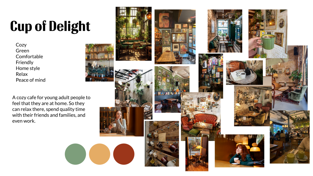
Color Palette

At Cup of Delight, the chosen color palette reflects the essence of the cozy, home-style atmosphere.
The deep maroon hue represents warmth and comfort. Inspired by nature, the earthy green embodies the harmony between modernity and rustic. It reflects the commitment to sustainability and ethical sourcing, bringing the outdoors inside for a tranquil and fresh ambiance. The soft peach tone adds a touch of sweetness and elegance to the palette.
Patterns

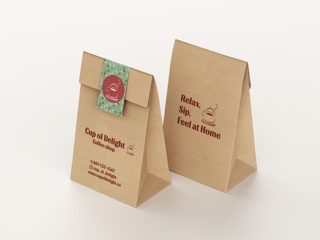
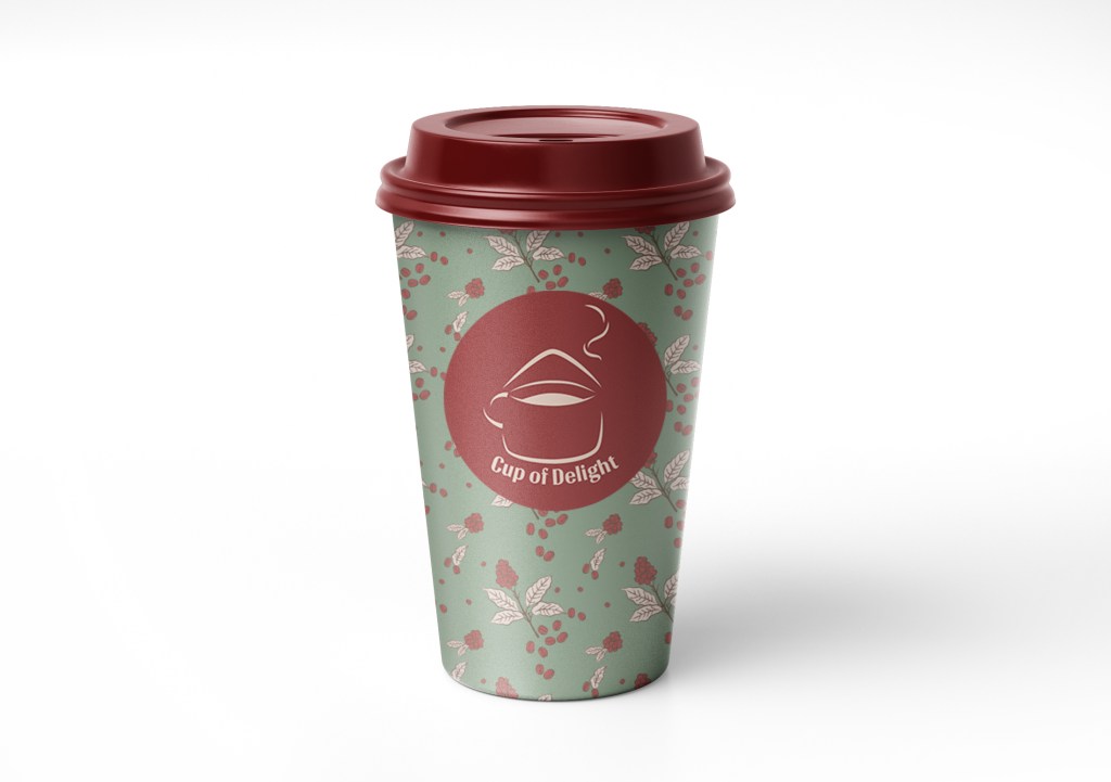
Three captivating patterns, born from the inspiration of coffee beans and trees, come together in packaging design at Cup of Delight. Each pattern, infused with a unique color combination, embodies the essence of the café experience. These visually striking designs convey warmth, vitality, and a connection to nature, reflecting the cafe’s commitment to sustainability and creating a welcoming atmosphere.
Typography

The BAR SADY typeface is a fitting choice for Cup of Delight, resonating with the essence of the cafe. Its clean and contemporary design aligns seamlessly with the modern and inviting atmosphere. The graceful curves and balanced proportions of BAR SADY evoke a sense of warmth and friendliness, complementing the homestyle comfort the cafe wants the customers to feel.
Choosing Open Sans for body copy aligns with Cup of Delight’s commitment to clarity and modern aesthetics. Its simplicity enhances readability, making the menu descriptions and promotional text easily digestible. With a clean and versatile look, Open Sans complements the contemporary vibe of the coffee shop, ensuring a seamless and enjoyable visual experience for the cafe’s patrons.
Logo
Sketches

Final Logo

The logo is a combination of a cup and a house to make a feel like drinking at home. The color of the logo is warm red in order to double the feel of the coziness of the cafe.
All the lines and corners are smooth and soft to be more friendly. In addition, the wave line at the top and the wave shape of the drink inside the cup indicate the relaxing place.
Mockups


The Cup of Delight project unfolded smoothly, resulting in a successful establishment of a welcoming and eco-conscious café. In future endeavors, I aim to improve customer engagement through targeted marketing and streamline operational processes for enhanced service delivery. A key takeaway is the significance of maintaining a cohesive visual identity aligned with the brand’s values. This project has provided valuable insights into the nuances of café concept creation, guiding our approach in future ventures.
