Business Branding I Stationary I Applications
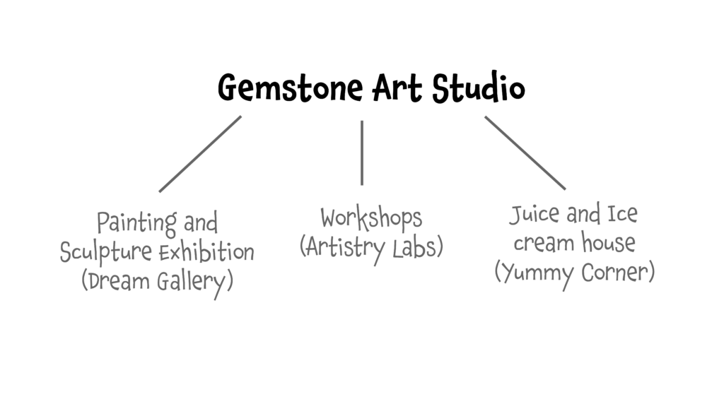
Gemstone is an art studio includes three different parts:
1) workshop, 2) Painting and Sculpture exhibition, and 3) Juice and ice cream house.
The target audiences of this studio are kids and teenagers who are interested in art, especially painting and sculpturing. They can attend different workshops in the studio, learn and exhibit their artworks in the exhibition. The studio invites students’ families and friends to visit exhibitions. They can buy the artworks at an affordable price as well. The third section is a Juice and ice cream house for both students and parents who accompany their children.
Logo Design


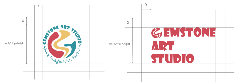
The logo design for Gemstone Art Studio incorporates abstract shapes representing the letter “G,” symbolizing the studio’s focus on discovering hidden talents and potential (“gems”) within young artists. The use of three different shapes and colors adds visual interest and captures the attention of the target audience. The rounded typeface of the studio’s name and handwritten tagline (“Where Imagination Blooms”) further reinforces the brand’s friendly and welcoming ethos.
Colors and Typefaces
Patterns
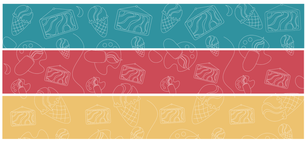
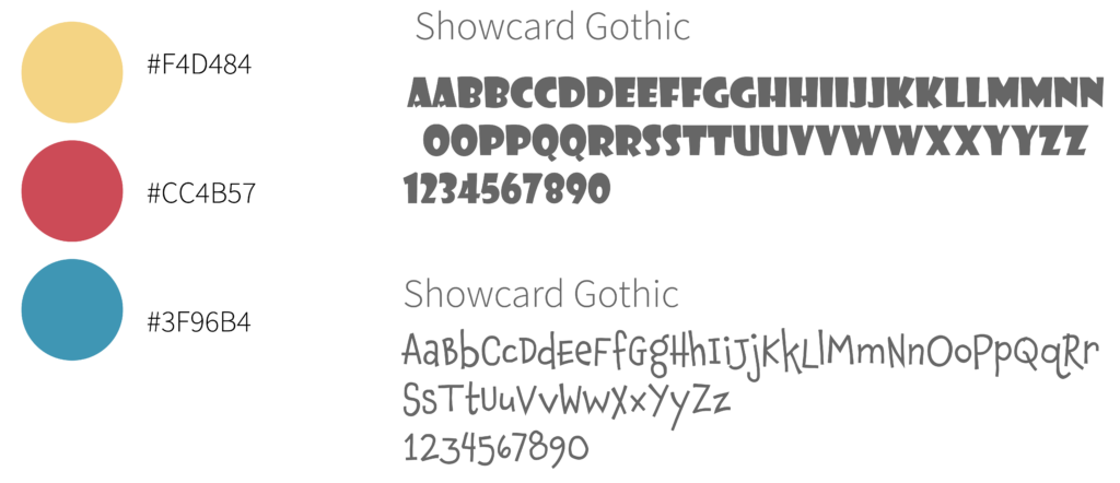
These vibrant and dynamic colors capture the essence of Gemstone Art Studio, conveying a sense of excitement, creativity, and warmth. From the fiery reds to the cool blues, each hue adds depth and dimension to the brand identity, reflecting the diverse range of artistic expressions nurtured within the studio.
Chaloops: This bold and playful typeface reflects the studio’s youthful energy and creativity, adding a sense of fun and whimsy to the brand identity.
Showcard Gothic: With its bold, distinctive letterforms, this typeface exudes a sense of sophistication and elegance, complementing the studio’s commitment to artistic excellence.
Icons
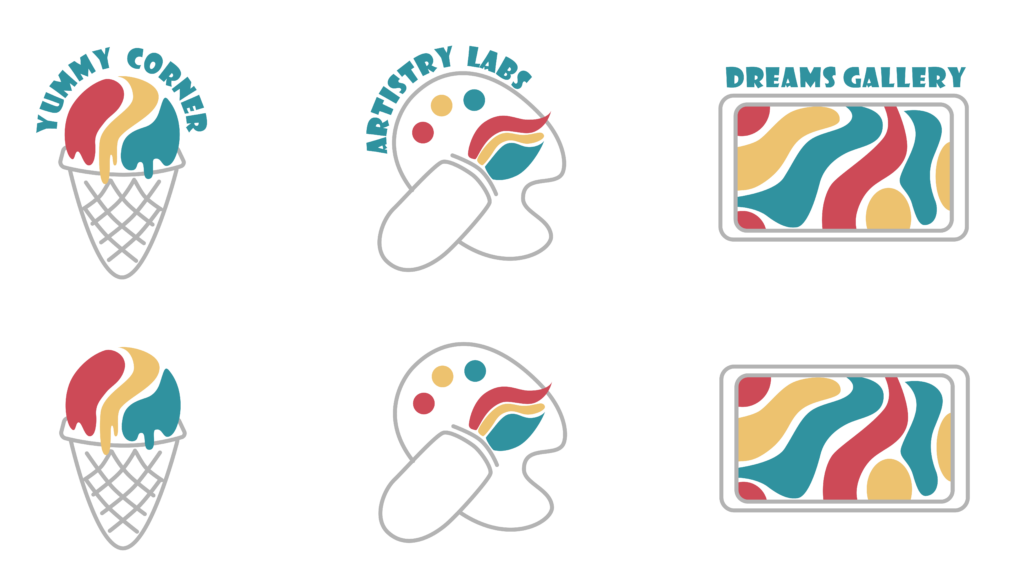
Designing icons for different departments is to provide users with quick visual cues that help them identify and navigate through the various areas of the studio. By using solid grey lines combined with shapes inspired by the studio’s logos, the icons maintain consistency with the overall branding while ensuring clarity and recognizability.
Business Card Design
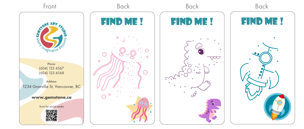
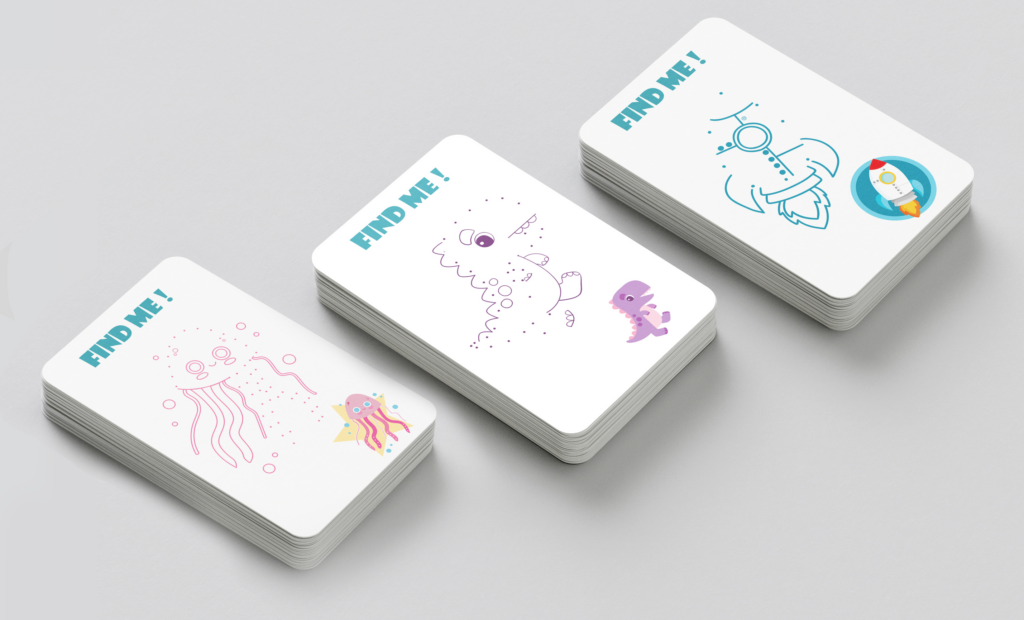
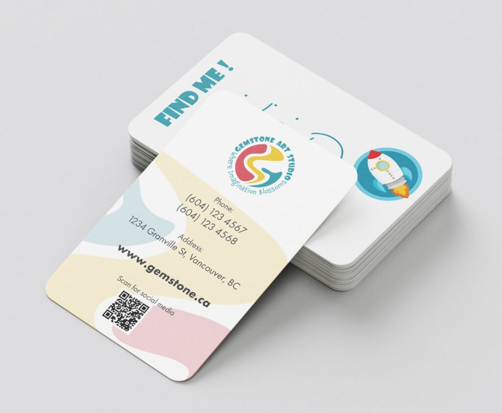
The business card for Gemstone Art Studio is more than just a contact card; it’s an interactive piece designed to engage the studio’s young audience. On the front side, there are studio’s logo, and important information. On the back of the card, a simple dot-to-dot puzzle game is presented, inviting children and teenagers to connect the dots and reveal a hidden image related to art or creativity. This interactive element not only adds an element of fun to the business card but also serves as a memorable and engaging touchpoint that reinforces the studio’s commitment to fostering creativity and playfulness.
Invitation Card
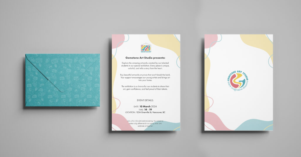
The front of the card features vibrant colors and captivating imagery, showcasing some of the artworks that will be on display. A bold headline invites recipients to the exhibition, while the studio’s logo and branding elements reinforce the event’s identity. Inside, essential details such as the date, time, and location of the exhibition are presented clearly and concisely, along with a brief overview of what attendees can expect.
Membership Cards
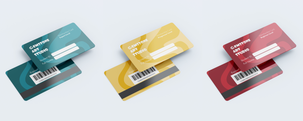
Membership cards for Gemstone Art Studio are designed to reward and recognize students’ commitment to their artistic journey. Available in three different colors corresponding to the three levels of student membership (beginner, intermediate, and advanced), these cards serve as a tangible symbol of progress and achievement.
Applications
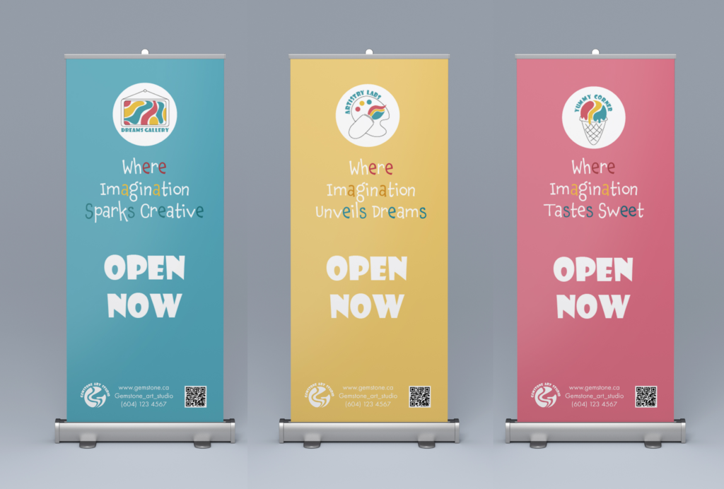
Three banners are designed for use inside the studio to introduce the departments. Each banner features the icon of its respective department, along with a tagline inspired by the studio’s main tagline, but customized for each department. Additionally, each banner showcases a different color from the brand’s palette. The phrase “OPEN NOW” is prominently displayed on each banner. Finally, each banner includes contact information and a QR code for easier access.
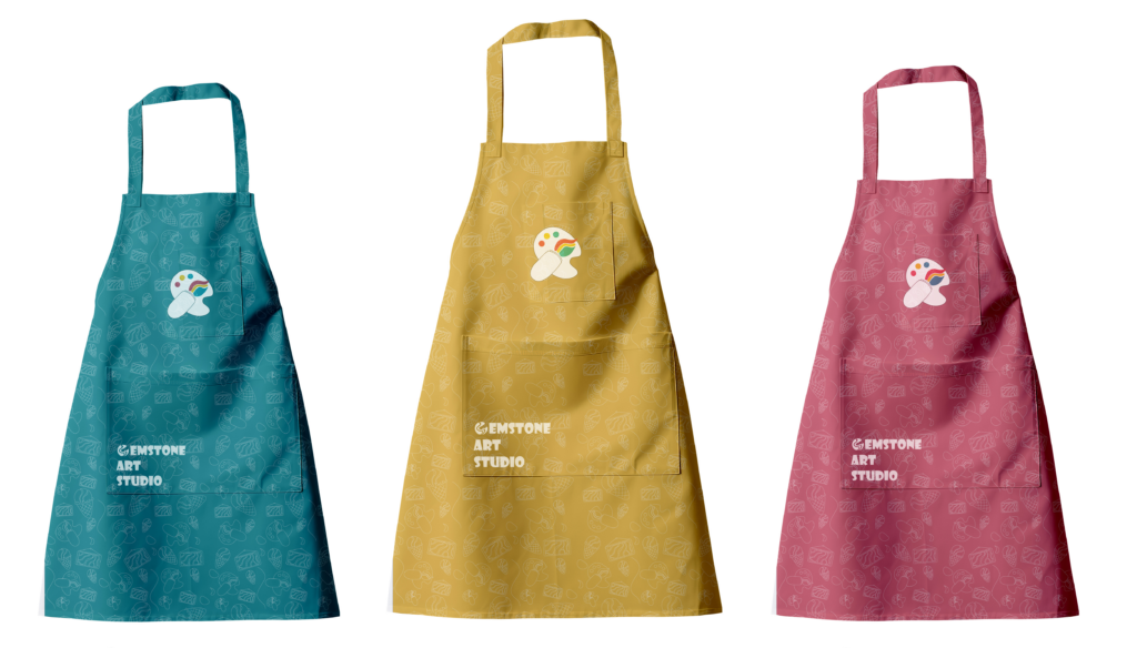
Aprons in three different colors for the “Artistry Lab” department for students in three levels, the red one for beginners, the yellow one for intermediates, and the blue one for advanced students.
Exhibition Labels
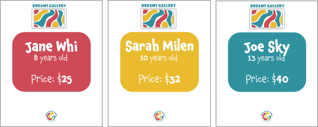
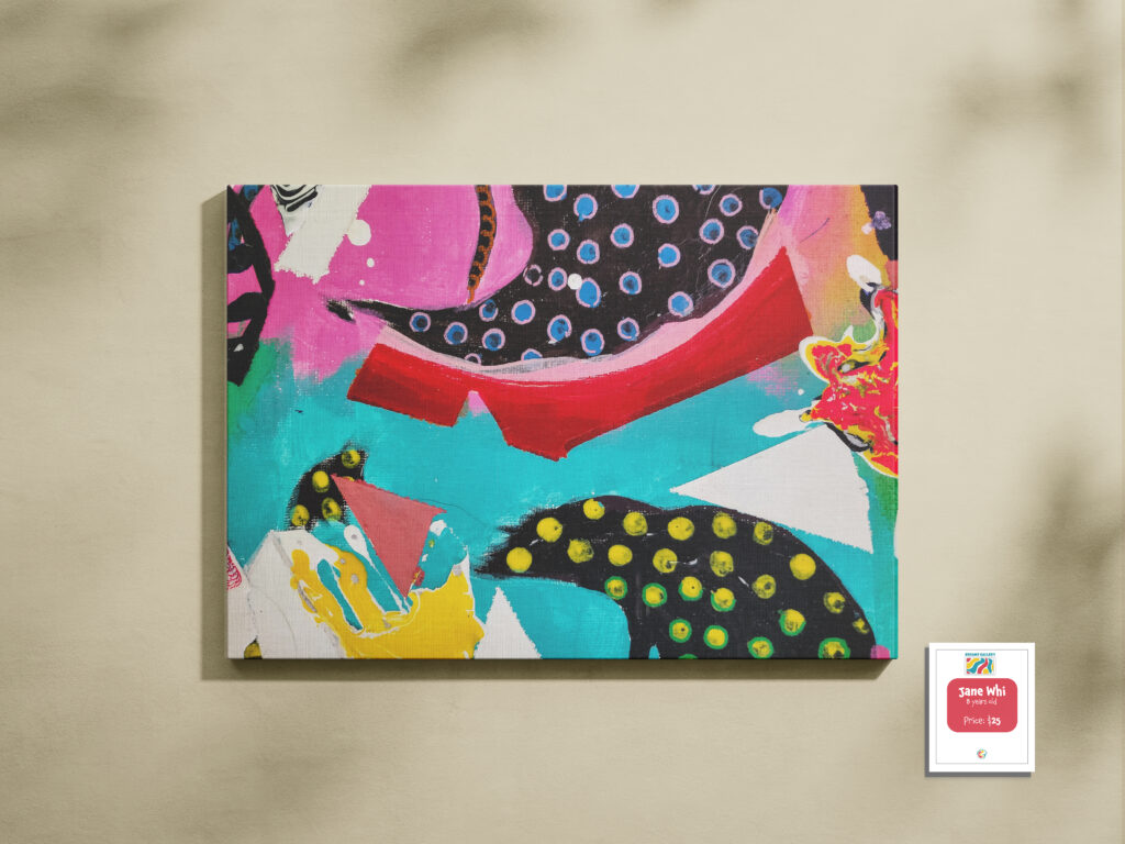
For “Dreams Gallery” which is the exhibition section. These labels will be used for artists’ artwork introduction, including their name, their age, and the price of the artwork. The color of labels is different based on artists’ levels, red for beginner, yellow for intermediate, and blue for advanced.
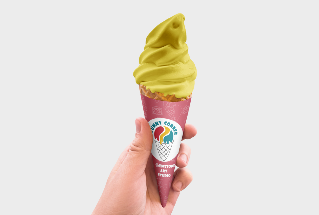
This design is for ice cream cone sleeves sold in the Yummy Corner department. It features the department’s icon, a red-patterned background suitable for food, and the studio’s secondary logo.
Social Posts
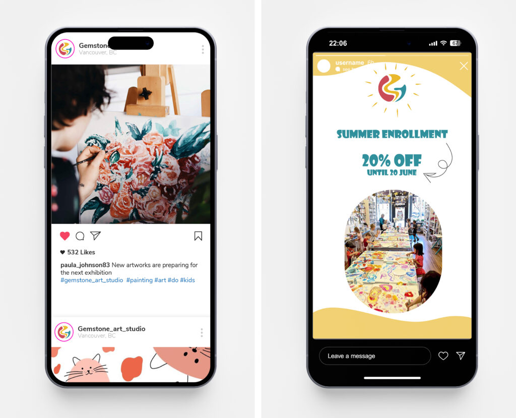
The Gemstone Art Studio project was a resounding success, effectively establishing a dynamic space for young artists. Our strategic design choices, such as the vibrant color palette and playful typefaces, resonated well with the target audience. Moving forward, we aim to enhance engagement through digital interactivity and innovative print techniques. A key takeaway is the importance of maintaining consistency in design across different mediums to reinforce brand identity, guiding our approach in future endeavors.